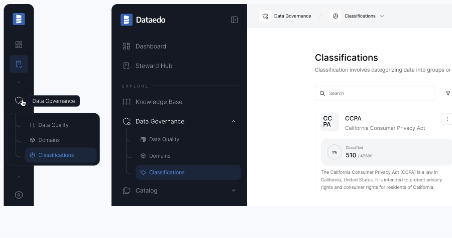
We're excited to share that we’re redesigning our Portal!
We’ve known for a while that Portal needed to be more user-friendly, and we’re making it a priority. Our goal is to make it easier for you to find the information you need and simplify navigation, so it’s less overwhelming for business users.
What’s changed?
We’ve updated the navigation to better reflect the Portal’s features. Related topics are now grouped together, reducing the number of main navigation items and making it easier for users to find relevant information.
Additionally, we’re starting a gradual redesign of the UI. We’ve made changes to both the look and behavior of the navigation. There are now two modes: the expanded version, which lets you easily browse all available options, and the compact version, which gives you more space to focus on the main portal area. You can switch between these modes at any time to suit your needs.

With compact navigation mode selected, you can click on a section to view an overview of its items. To go to a selected page, simply click the box that appears. Hovering over the main section icon will display a tooltip with its name.

Old vs new navigation items
As we grouped some elements together, we also updated a few names and added labels to these groups. Below, you'll find a screenshot that shows the mapping between the old and new navigation. Most of the items are still there, but they may be in slightly different locations. The only item that’s no longer in the navigation is the Keyword Explorer, but don’t worry – it’s still accessible through our search results.
In addition, the new navigation brings in some new features, including Data Quality under Data Governance, and new sections for Master Data, Critical Data, and Badges within the Portal. These three sections can be customized, allowing you to choose whether or not they appear in your navigation.

The admin settings have also been moved to the side panel, maintaining the same structure as before.


 Maria Pulawska
