
Our tool draws diagrams to visualize and document a database. We are often asked about the ability to put hundreds of tables in one diagram. We designed Dataedo from belief that diagrams are useful for communication only when they are small (this is something I think I learned from Oracle) and therefore designed it to support multiple small diagrams with narration based on metadata from central data dictionary. This data dictionary can be huge, but diagrams itself are small.
But many of our users wanted to create one complete diagram for the entire database. When we asked why would they need such a diagram and what problem would it solve they mostly replied that this is what they were tasked with by the manager - build a diagram of the legacy database.
Later I found interesting topics on StackOverflow where people shared their experiences with similar tasks. I am citing most interesting pieces below. I hope this gives you a good idea on what to expect, whether it’s a good idea and what you could do instead.
Comments from the community
Below is a compilation of the comments from two StackOverflow topics:
- SQL Data Modelling/Mapping Software for 200+ Tables
- How to generate a diagram of a very large database schema (SQL Server)
We've put all of our legacy application tables into SQL Server 2005 and my boss is looking for a snazzy way of viewing the data... basically something to say "this is what we maintain".
I have a very large database I need to diagram. (...) there are hundreds of related tables, each with up to 2000 fields (some are sparse), multiple relationships between tables (often hundreds per table, in fact), multiple schemas... you get the idea.
I tried to use the Database Diagrams feature of SQL Server Management Studio, but it crashed (...) I tried to use Visio's (...) but that's been going for a few hours with no sign of completion.
Just to emphasize, the diagram is indeed not supposed to be used for actual useful reference. It's a client relationship management device to demonstrate the complexity/scale of the system.
kd7:
Generating an image of any kind for a database of that size simply becomes eye candy that is stuck on a wall that draws gasps, and honestly serves no real purpose except occasional glances. (...) I've been down this road before trying to diagram a huge database, and I succeeded to some degree, but never found a good outlet where it was of some use.
Maybe they're going to use a projector to display it on the side of the building in the evenings. The database equivalent of a drive-in movie
I once tried a diagram of 800 tables. It was I think 60 pages wide and 30 high or so. Not a wall in an office - the sidewall of an office BUILDING. The poster obviously has not through what he actually wants here
Ended up delivering the output of this tool (Redgate SQL Doc) - far more useful (quite apart from the fact that no graphical tool seems to be up to the job).
KM.:
I worked at a place that had several hundred tables (near 1k) and no one really knew what was going on in the system, company was growing and hiring a lot. A guy was tasked with doing a diagram, and he auto-magically created a gigantic tiled poster that contained every table with lines connecting various tables. (...) The "poster" was put on a wall in a common area, and got a few looks, but no one ever really used it, it was unusable, too cluttered, too unorganized. As a result, I used MS-Word to create a single page diagram containing the 20 main tables (...). Eventually everyone wanted a copy of my diagram, including the person that made the "poster". When I left that job they were still giving my diagram to new hires.
I recommend that you work like an explorer, find the key tables and map them as you go, making as many specific diagrams as necessary as you discover the system. Trying to make a gigantic "poster" automatically will not work very well.
KM.:
Who has one street map of the entire world? you usually have detailed maps for each important area, when driving in one city, there is no need for details about another city.
I'd avoid doing the whole thing in a single diagram. (...) It's probably not possible to easily comprehend a diagram with hundreds of tables with potentially thousands of records per table. Can you generate diagrams of smaller logical areas with some overlap to other logical areas?
Yes, when we've done large databases before, breaking them into logical areas has worked out quite well. If you can't break something that big into loosely-coupled logical areas, you've probably got more problems than your diagramming.
 An attempt to visualize large database schema
Takeaways
Here I summarize takeaways from the experiences shared above:
- Reasons for creating diagrams for the entire large database are:
- Show off and do something cool
- PR/marketing tool to show how complex databases are being maintained
- Most such efforts are initiated by managers (not the people who would create or use them)
- Most software can’t handle hundreds of tables
- Creating such a diagram is a nightmare
- They provide no real value for database users
- After the initial wow effect nobody cares
If you actually want to underatnd your database, the solution is different: small, well thought out diagrams with key tables.
Our advice
Our advice, in line with software engineers above, is the following (it includes vendor agnostic guidelines and some product placement).
 Database documentation export from Dataedo
Define subject areas
Handling hundreds of tables can be overwhelming. Start with something easier - identify subject areas in the database, such as: customers, inventory, products, etc. Start with key ones and add new later as you learn more.
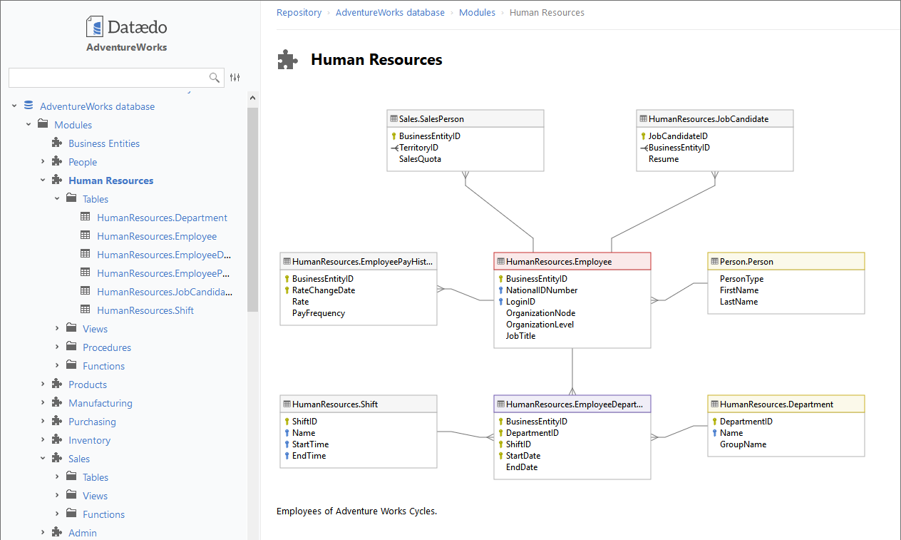
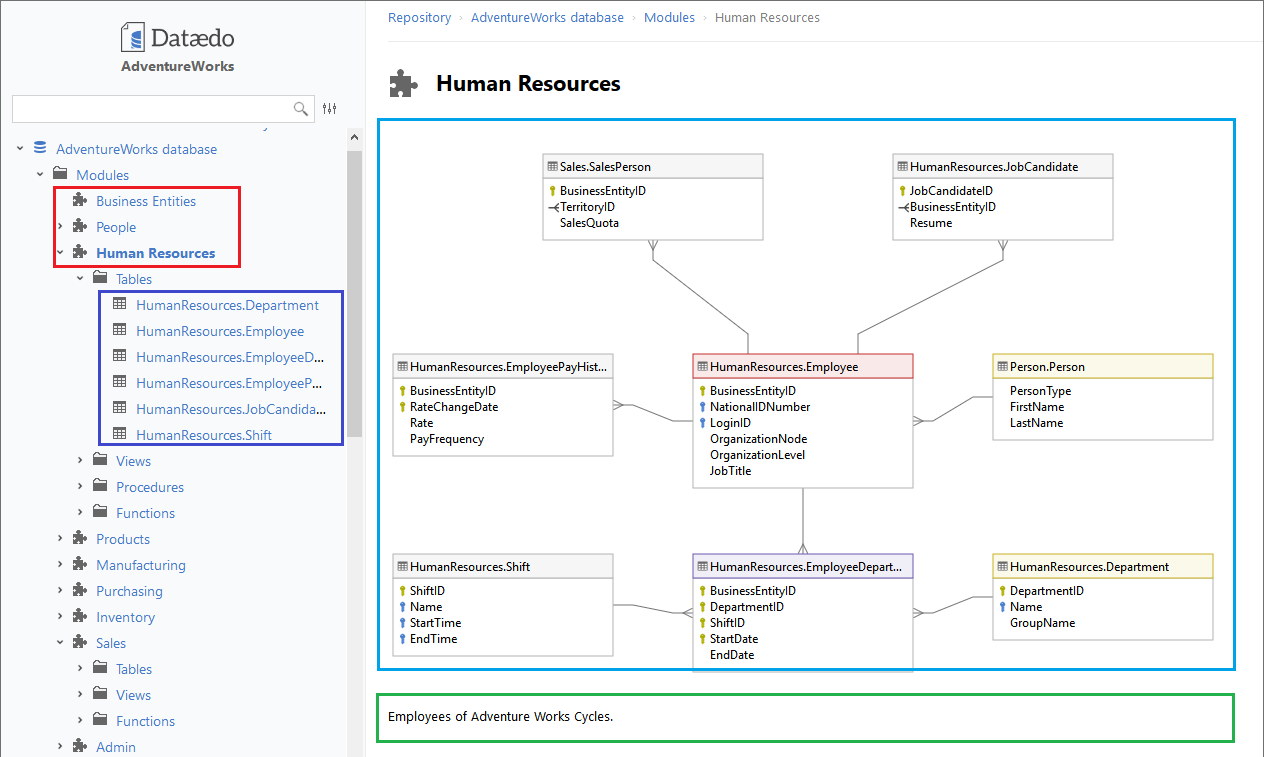
Dataedo is a perfect tool for this with its modules (marked with red on the screen below). You can define a list of modules for each database, provide a description for each module , draw a diagram and assign a list of tables. Then you can share everything in HTML.
Create a small diagram for each subject area
For each subject area draw a small diagram (up to around 30 tables) with only key tables. Use areas and colors. Hide any unnecessary details.
You can use any data modeling/database design tool, but Dataedo is a great fit for this as well allowing you to quickly create a diagram for a module by adding tables from the data dictionary, choose which columns you want to show, and share as interactive diagrams linked to complete data dictionary.
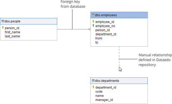
Find and document table relationships
Often you can’t just create a diagram of a database by simply running a reverse engineering function in the tool because the database has no foreign key constraints and there are no links between tables on the diagram. You need to define them manually.
Data modeling tools allow you to define table relationships to draw a diagram from the database schema. Dataedo does it nicely adding an extra layer of table relationships without interfering with physical schema imported from the database.
Provide a description for each subject area
For each subject area provide text description and explain business logic and key objects/tables.
You can use Word for this, but as before, Dataedo provides a rich text editor where you can write formatted text and paste images. Modules, diagrams, data dictionary and subject area descriptions end up in one integrated documentation.
Assign tables to each subject area
You can also assign tables tables to subject areas so it’s clear what is its purpose and what functionality or module it is part of.
You can do it in a spreadsheet, Word or use subdiagrams in the data modeling tool. Dataedo allows you to easily group tables into modules with a simple drag&drop and lists those tables on the module page.
Document low-level design - document data dictionary
OK, so by now you have described key areas and visualized them with diagrams. This is a very good top level view description of the system. Now it’s time to provide detailed documentation of each table and column. This is often called a data dictionary.
This can be done directly in the database with table and column comments and shared with one of the tools, but keeping descriptions in a database has some disadvantages. You can also do it in an external tool such as data modeling tools but they are a bit clunky and don’t guarantee you won’t lose comments. Again, Dataedo is there to help with its physical data dictionary integrated with the source (metadata is kept in a separate repository but it’s easy and safe to update from the source) where you can provide descriptions, aliases for names and optional fields and classifications.
Share!
Now the final part. Share the documentation you created. It has only value if people are using it. You can print key diagrams and put on a wall but I advise to share entire documentation in one bundle (all the above). Dataedo has all out of the box. Don’t wait, start today.